
You and your committee are getting ready to start working on the yearbook, but you feel like everyone is going is a different direction? Colours, layouts, fonts – there are so many options! How do you get organized?
What I like to do is start by creating a visual collage on a piece of paper or screen to map out my yearbook and visualize what it could look like. This is called a inspiration board. What’s great is that Laurentien has an “Inspiration Board” tool and it’s really easy to use! You can find it in Laurentien Templates (Inspiration Board).
What’s an inspiration board?
It’s a visual collage of images, colours, textures, fonts and even keywords that express an idea, a mood, a style or a concept. It’s an awesome graphic design tool. You can use it to explain your vision, communicate your intent and inspire creativity.

Why create an inspiration board?
- To define a visual guideline before starting a project.
- To ensure the committee is on the same page regarding the project’s aesthetics.
- To provide inspiration and encourage the exploration of different creative ideas.
Here are the steps to easily create an inspiration board:
- Define the objectives
Before you start, ask yourself a few questions. This is what I ask myself when I start a new project:
- What are the yearbook’s theme and style going to be? Will it be sophisticated and glamorous, or fun and colourful?
- What emotions do I want to feel when I look at the yearbook in a few years from now?
You can find a ton of information at: https://laurentien.ca/en/yearbook-theme-style/
- Visual research
To get inspired, you can look at different visual sources or go through your school’s previous yearbooks. I tend to draw inspiration from social platforms, fashion magazines, and Boogie, since it has hundreds of inspiring templates with pre-made themes.
- Select the key elements
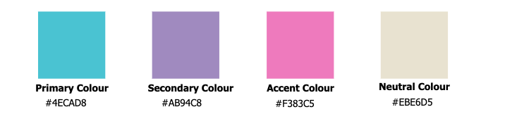
Colour
To get that WOW factor, I like to select some specific colours, but not too many, because I don’t want my project to look like a pizza. I start by choosing a dominant colour, then I choose a secondary colour and an accent colour. Sometimes I also add a neutral colour (black, white, grey or beige).
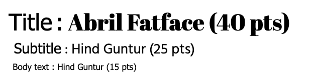
Font
I always recommend using two fonts, or three at the most. You can use a fantasy or script font for your headers, and a serif or sans-serif font for the other texts to make sure they’re easy to read.
Backgrounds, decorative elements, photo frames, etc.
I’ll then add to my inspiration board the backgrounds and any other graphic elements I like and that will be repeated throughout the project. This gives me an overview of all the elements, and allows me to make sure the colours, fonts and graphic elements all look good together. This saves a lot of time and leads to a stunning yearbook!
- Reviewing and fine-tuning
Once the board is done, I’ll take a step back and ask myself a few more questions:
- Does the inspiration board accurately reflect what the committee had in mind?
- Is it clear and inspiring?
- Can it guide the next steps of the project?
To conclude, the inspiration board truly is your committee’s best bet when it comes to starting off your project on a good foot. Taking the time to prepare it thoughtfully will save you a lot of hesitation and questioning. With Laurentien’s Inspiration Board tool, it’s even easier to get started. Now it’s your turn: unleash your creativity and have fun making an inspiration board that reflects who you are!
Audrey Larocque
Graphic Design Project Manager