
Every year, I see committees start creating their yearbook with enthusiasm… But sometimes, the members start working in silos. The result? Disparate pages and a less coherent yearbook. Personally, when I work on a yearbook, the first thing I look at is the visual coherence. It may seem trivial, but it makes all the difference between a professional-looking yearbook and a yearbook that looks like a draft or, as I like to say, kind of like a pizza! 🤪
I’m going to share my top graphic design tips. Follow them to make your yearbook look amazing, from start to finish. The good news is that it’s not complicated, but your team has to adopt a few good habits right from the get-go.
- Choose a theme
The first step is to work together to choose the style you want for your yearbook. Do you want to go for sleek and modern? Retro and colourful? Chic and glamorous? Whatever you decide, the important thing is that everyone sticks to it. If one page looks like it’s from a high-end fashion magazine and the next one looks like it’s from a 2000s-era scrapbook, well… That doesn’t look great.
I recommend always starting with a moodboard: an inspiration board with images, colours and fonts. This will help everyone stay on the same page and can be used as a reference throughout the year .
- Restrain your colour palette
I know, it can be tempting to use lots of colour. But believe me, that quickly becomes chaotic. The secret is to choose 3 to 5 colours. In Boogie you can even create custom palettes to make your life easier!
Here’s my winning formula for perfect palettes:
- A main colour: Often the school colour or a colour related to the theme. It sets the tone for the entire yearbook.
- One or two secondary colours: They complement the main colour and add a richness to the whole.
- A neutral colour: A must-have to balance everything out. White or grey always works.
- An accent colour (optional): Use this one sparingly to attract the eye to specific details.
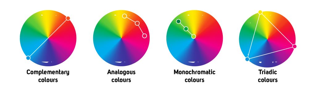
I like using colour theory and the colour wheel to choose colours that work well together:
- Complementary colours: Two colours that are opposite each other (e.g., blue and orange) for a dynamic contrast.
- Analogous colours: Three colours that are next to each other (e.g., pink, coral and peach) for a softer palette.
- Monochromatic colours: Different shades of the same colour (e.g., aquamarine, olive green and forest green) for a chic look.
- Triadic colours: Three colours that form a triangle (e.g., blue, red and yellow) for a vibrant balance.
- Don’t overdo it with the fonts
Fonts are like spices: if you use too many, you’ll ruin it all! As a committee, set yourself a rule: two fonts, three at most. One for headers, one for the text, and, if you want, a decorative font for quotes or special texts.
If everyone uses their favourite font, the yearbook will lose its coherence. Use the chosen fonts for a harmonious yearbook that reflects your team work.
- Use templates
I can’t emphasize this enough: Templates save ! When working as a team, they’re even more important. By using templates, you make sure that all the pages have the same margins, spacing and proportions. Each committee member can add their creative touch without messing with the visual whole.
- Repeat graphic elements
To create a strong identity for your yearbook, identify a few elements that will be repeated throughout the pages: a background design, a type of frame or illustrations in a specific style. These details preserve the common thread, even if several people are working on different sections.
Conclusion
Preserve the graphic coherence, as that’s what will make your yearbook a memory that you will still want to flip through in 20 years from now.
Before you submit your pages, take the time to look them over together. With more people checking, you can more easily spot any inconsistencies and fix things before printing. I often find myself speechless when I see how well designed some yearbooks are, because these collective decisions make all the difference when you finally receive your printed yearbook. Believe me, getting to hold such a hard-earned result… It’s worth every ounce of effort !
Katherine McKen-Savard
Computer graphics trainer